A Sneak-peak Into Zapier’s Killer Website Design And Messaging
A powerful tool that helps automating tasks by integrating various tools used widely across the globe, in ways that are customizable. With big players integrated within the platform, Zapier makes sure to communicate the vast possibilities of its platform.
Website
Zapier.com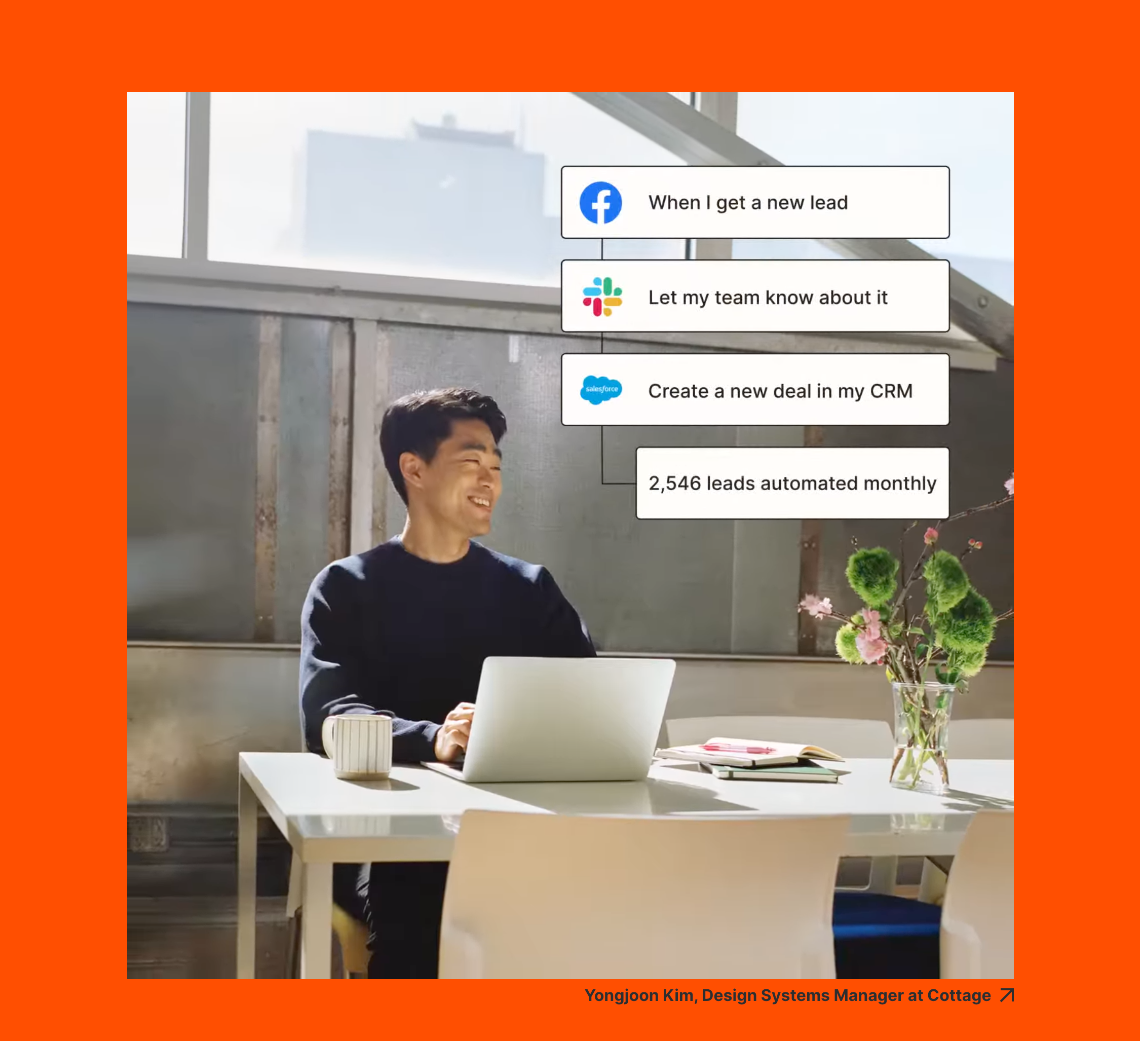
Thank you! Your submission has been received!
Oops! Something went wrong while submitting the form.
Website Messaging
Messaging & Headlines
- The hero section starts with a strong heading that sums up what Zapier does in a simple and small sentence.
- The heading also has rolling text where the text changes from 'sales outreach', possibilities, 'opportunities', 'copy/paste', 'contacts' etc. This is a clever way to utilise the real estate in the hero section header by not only keeping serious words but also adding some fun, relatable copy in it.
- The sub header goes a little deeper in explaining the platform and what it can do as well as the criteria - 'no code required' a ver important detail against the competition in the landscape.
- A small workflow animation also continues on loop showing the crux of what Zapier does.
- As the user scrolls through the sections a format is followed to keep the messaging easy to grasp.
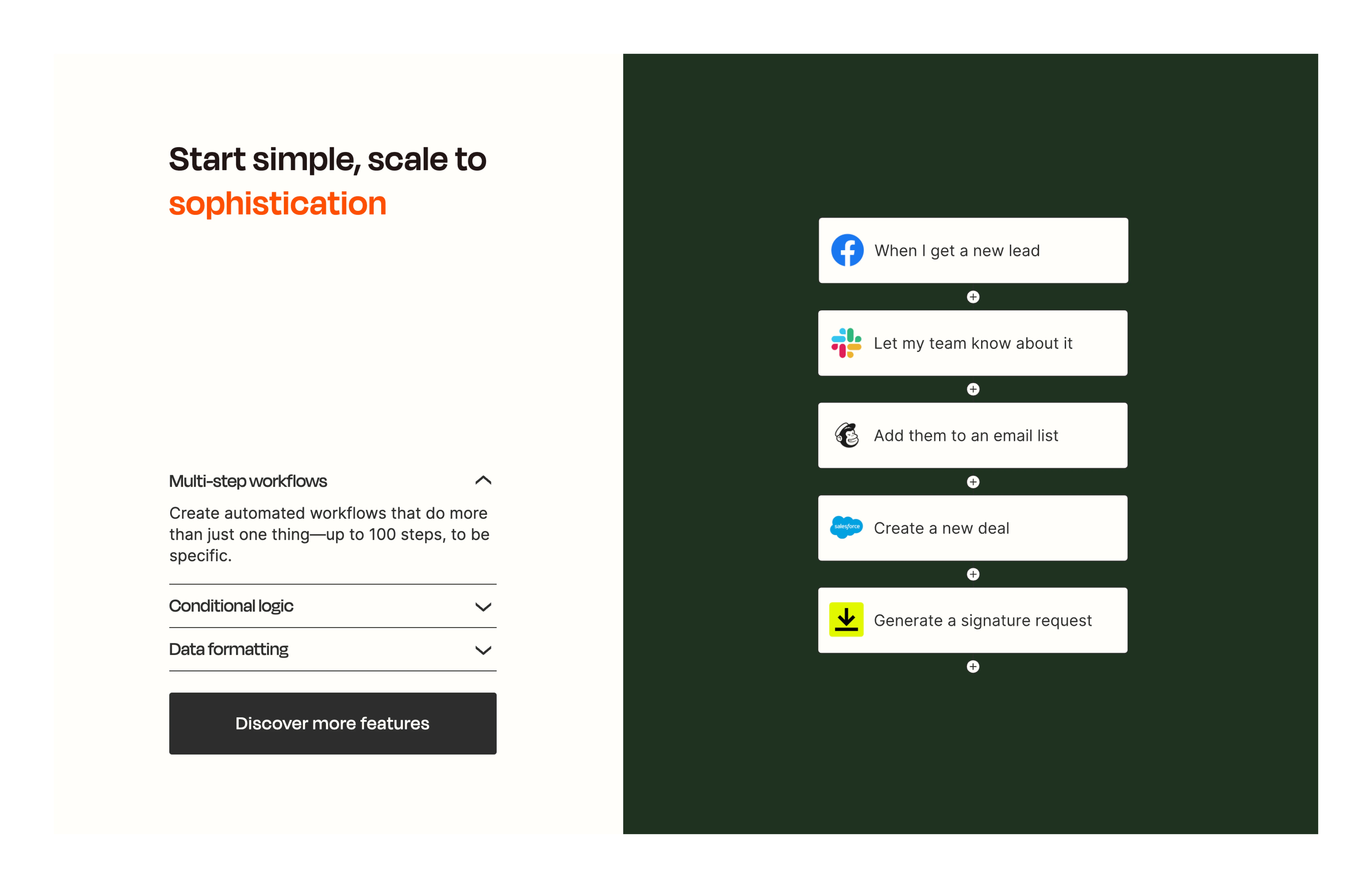
- Each section's header has a value proposition that is further explained by means of a workflow alongside.
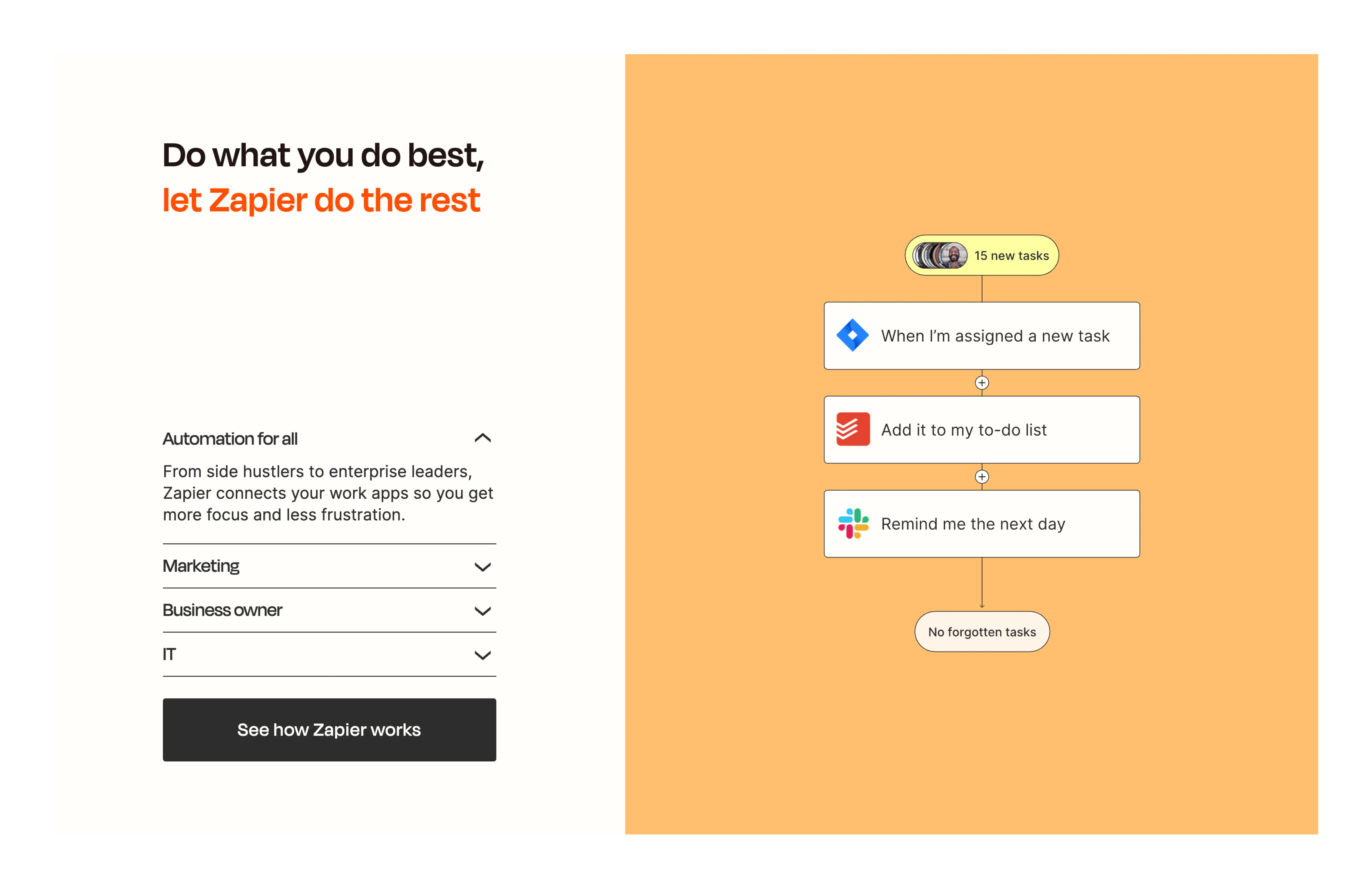
- These sections also have tabs that have messaging targeted at different personas and how the platform aids in their workflows.
- Catchy lines and phrases close off the section with a memorable outcome.
Content Framework
- Following a set format within each section, the messaging is centred around personas, an effective way to tackle a homepage.
- The automation is explained in a simple manner understandable by a layperson.
- The best practice in PLG/PaaS/SaaS websites to show workflows not write about them. It is highly unlikely at this point that the ICP will miss/ not understand the offering
- Categorical classification- Very clear classification to address the personas and how Zapier works for each with a use case.
- This makes it clear that there are personalizations based on requirements already thought off
The framework is simple and foolproof. Animations visually show, content talks about the rest.
Conversion Copy
- The ease of using the platform is written in a sentence. What may have been a daunting migration or integrating into current flows, is addressed.
- The prompts within the micro-interaction, are also in simple language. Here, the multitude of apps that can be used in a single “zap” are displayed. All major players are listed that are used widely across industries liek Slack, Jira, ToDoist, Mailchimp etc.
- Simplified into 3 categories of the capabilities of the platform.
- Instead of a multi paragraph section, the types are divided and explained
Visuals are designed in lieu with the content. This is evident with the way the content not only drives but adds to the website’s effectiveness.
Visual Design
Brand Language
- Visuals are designed well and cohesively to enhance the content framework.
- The simplified workflows, website layout and bold colour highlights, all drive the messaging further.
- The language is built with bright colours paired with a neutralising beige that is warmer than a 100% white.
- A retro 90s style is predominantly utilised on the website aiding in creating workflows.
- Degular, a stylish typeface adds eccentricity to the pages with focus retained on the copy.
Animations
- Animating for purpose, the website's workflows are animated, consistently in all sections.
- Even the hero section hosts a workflow animation on loop.
- There is a utilitarian purpose with the animations that grabs the eye with reason of simplifying and explaining.
Technical
Responsiveness
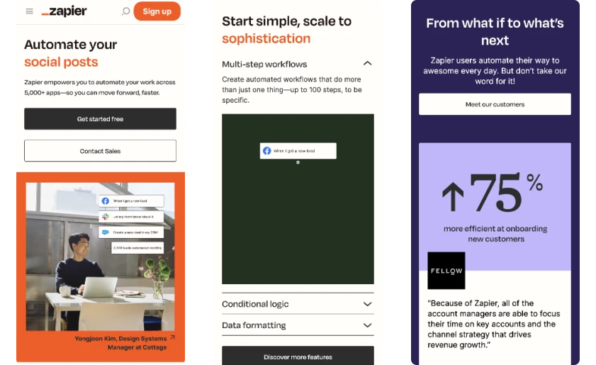
- A responsive website, adapts to the devices seamlessly retaining all the elements seen in the desktop site.
- The simple design adapts well in the mobile responsiveness, it seems important that all the components are retained to prevent loss of any messaging or communication.
UI
Layout
- A consistent content framework ensures that the communication is effective but also makes sure that the design is foolproof. It minimises a hurdle of having to bring attention to the copy unless an effective framework is put in place.
- The personas are condensed in tabs but supported with animated workflows that don't need further explanations in written words.
- Unlike most websites, Zapier uses the same layout for each section with content on the left and visuals on the right in a bright hue.
- This is far from making a website monotonous. Wherever required, the sections also have a centre alignment.
Memorable
- The eye-catching colors, animated workflows, usage of integrated tool logos along with the very strongly crafted messaging and content framework establish the clarity in a visitor's mind.
- The pairing of straight-forward statements and fun phrases create a memorable outcome.
- Overall the approach of the website's communication is outcome based- 'the time you can save to do what you are best at'.
- Anticipatory elements like integrations ready to be deployed, persona based automations prove that customer journey is important and paid attention to.
UX
Navigation
- Relevant CTAs at each section lead the user to a page where they can read more
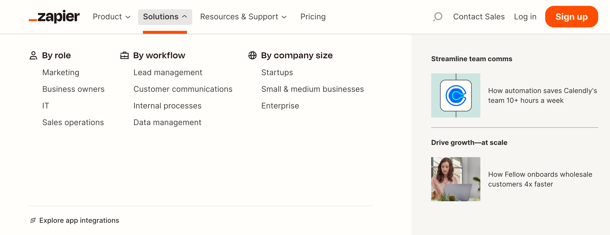
- The navigation bar has detailed dropdown menus that have additional resources along with page links, making it easier for discovery.
- The in-depth knowledge on persona based automations has a list of its own in the drop down menu.

Trustworthy
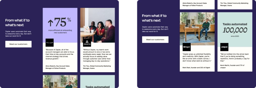
- Customer Success stories are displayed two ways- one with metrics and the other with imagery. This way numbers are displayed as well as the human aspect.
- Different motivations are targeted by doing this, since one type won't convince all.
- The copy addresses a common hurdle companies face of “what if xyz was possible”. Zapier leverages that to call out to more such people.
- The possibility of a better tomorrow as attested to by users creates hope and a feeling of FOMO.
- An interesting section on the website is the incorporation of tweets written by real users of Zapier. This is a fun and effective way of incorporating social proof but not having to craft any content and letting the actual users talk about their experiences.

Conclusion
A website built fundamentally on messaging, utilising visual design to elevate and capture the users arriving here. There is no element, section or component that is placed on the page without reason. It is important to note that the visuals follow content and not the other way around, supported by animations of workflows. The concept of automation and integration is made simple to understand and the outcome based scenarios build a strong scenario in a prospective user's mind.


