A Cross Industry Benchmark - HashiCorp
A company that helps organizations utilise cloud for their workflows, helping them migrate, secure and operate their workflows. They are responsible for building tech infrastructure that in turn focuses on workflow creation instead of solely focusing on the technologies.
Website
HASHICORP.COM
Thank you! Your submission has been received!
Oops! Something went wrong while submitting the form.
Website Messaging
Messaging & Headlines
- Clear & concise messaging in each section, where copy is choppy and in simple sentences.
- There are mentions of the product names within these sentences to further clarify and create familiarity with the users.
- An actionable statement in the header that quickly gets the message across.
- Context is the key element here, it is set in the headlines. As the user goes through the website, the copy adds to this context with simple sentences.
- The Target Group (TG) is set, addressed and called back on at multiple intervals. This retains relevance with the most essential messaging.

Content Framework
- A classic B2B approach with some differentiated aspects.
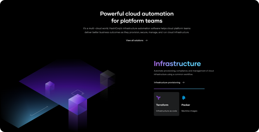
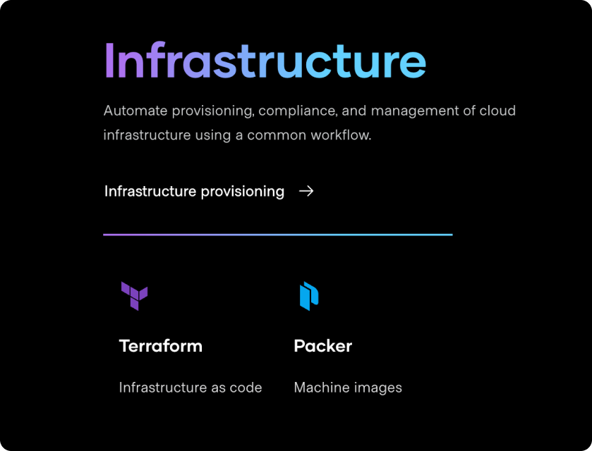
- The solutions section in the homepage, is detailed with relevant information that motivates the user to take action or at the very least, understand and familiarise with the products.
- Solutions are names and addressed in simple terms by a short description that lists the services covered, followed by the product name & logo.
- The footer has an unusual approach with the solution listed separately for ease of accessibility,
Conversion Copy
- The copy isn’t riddled with jargon, keeping it simple.
- The focus is imparting necessary information to the user, to facilitate this, the copy focuses on what the user gets or can do with the products and solutions.
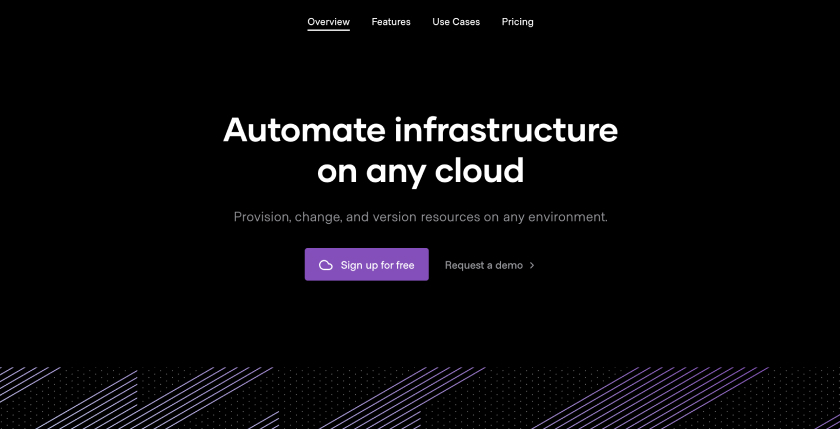
Hashi Corp has recognised that the users arriving on the website are mostly looking to compare between competitors. The motivation to educate the user about the products is very astute.
Visual Design
Brand Language
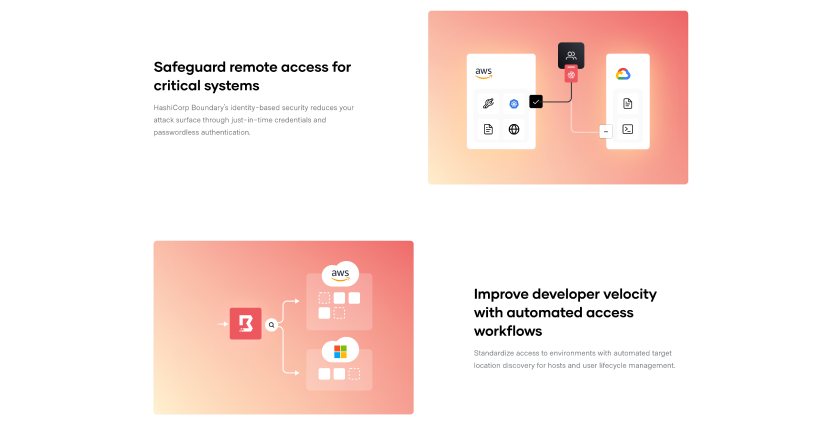
- Starting with a clean white or white background, provides a strong playground for vibrant color-play
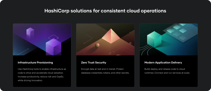
- With a bright color palette where each solution is associated with one, the visual design is far from boring.
- Transitions between the black and white backgrounds is seamless and remains cohesive with the look and feel.
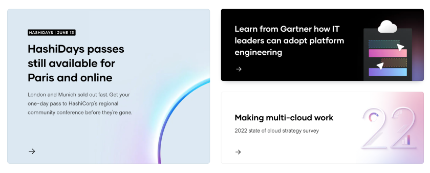
- A clear system dictates the usage of the vibrant colors on black backgrounds and their tints on white.
- With almost no images, the brand retains an expert position, focusing only on copy, messaging.
Illustrations
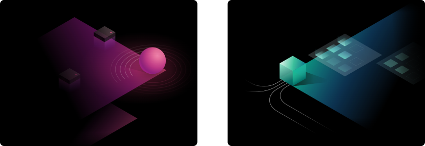
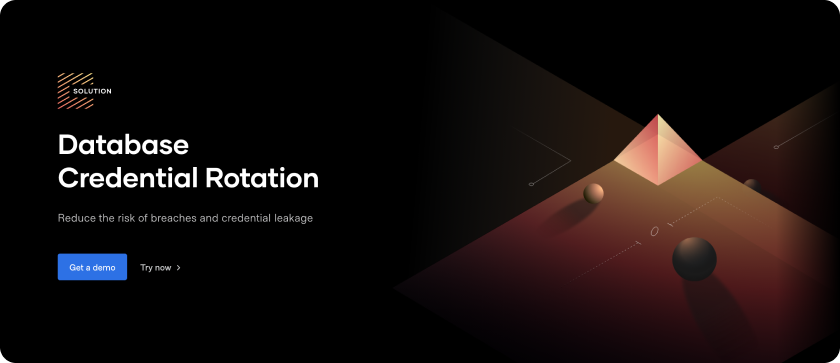
- Isometric grid base, gradient color tones applied not only on the assets but also on the text. This provides clarity on where each solution starts and ends.
- Abstract associative concept drives the visual language. Each solution has an illustration associated to it.
- This has better recall value, rather than stock images with random people/ landscapes.
Motion Graphics
- A minimal motion graphics on the hero section draws the user. Beyond which the page is simple letting the copy and the visual take lead.
Interactions & Animations
- Addition of these would elevate the overall experience. But the question arises is it really required? Probably not.
Brand Language
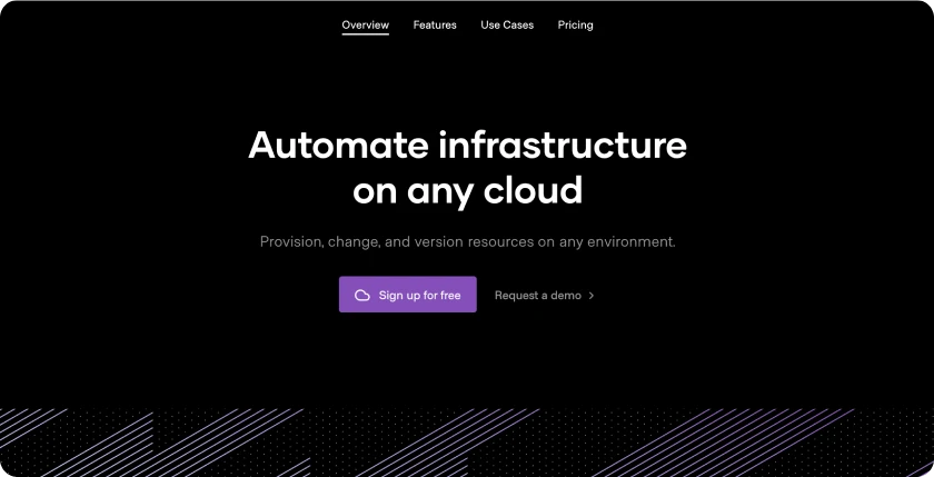
- The product page hero sections do not capture attention or create an engaging factor.
Technical
Responsiveness
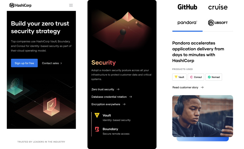
- A responsive website, adapts to the devices seamlessly retaining all the elements seen in the desktop site.
- Unlike many websites that drop components when it comes to the mobile version, Hashi Corp keeps all the elements.
Layout
- Layouts of the product pages aren’t very engaging and almost seem disjointed, when a user journeys from the homepage. The infographics follow the same visual look.
- This could have been a choice made to retain focus on the business side, where the homepage draws in the user, beyond which the objective is to provide relevant information.


UI
Layout
- A simplified layout ensures a ease of adaptability to mobile.
- Although simple, it is not monotonous. This is where the visual design and UI cohesively work together to deliver a memorable website.
- Usage of tabs to showcase customer stories, where the hierarchy highlights the brands like Github, DecathlonTech, Ubisoft - aiding in credibility.
- Repeated callback & CTAs that lead to the product’s page is important to note.
- A secondary nav bar in the product pages keeps the user within the particular page without the need to look for the next link.
Memorable
- The homepage captures a visitor’s attention, more-so of the ones that work in the same/ similar industries.
- A benchmark, this website is engaging without use of interactions, animations or other high jinks.
Layout
- Layouts of the product pages aren’t very engaging and almost seem disjointed, when a user journeys from the homepage. The infographics follow the same visual look.
- This could have been a choice made to retain focus on the business side, where the homepage draws in the user, beyond which the objective is to provide relevant information.


UX
Navigation
- Each section has mentions of the relevant products used, which are the CTA buttons.
- There are no repetitive CTAs that ask the user to “Sign-Up”/ ”Get in Touch” etc.
Contact
- First in the hero section, after which the Contact Us CTA only appears right before the footer.
- It is clear that the brand wants the user to go through the information first and then reach for the contact.
Trustworthy
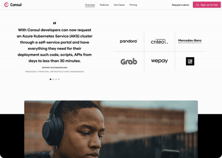
- Testimonials help build credibility and trust for a prospective client. Hashi Corp has taken a different route to this. Use Cases of companies are displayed with mentions of the products utilised to achieve the outcomes.
- Strong copy with action words like “Pandora accelerates application delivery from days to minutes with HashiCorp” has a positive impact.
Website Flow & Hierarchy
- A concise homepage, detailed product pages, strong copy and clever use of color, all lend to the ease of the flow of the website.
- The pages aren’t unnecessarily long, with repeats of the same information in different ways.
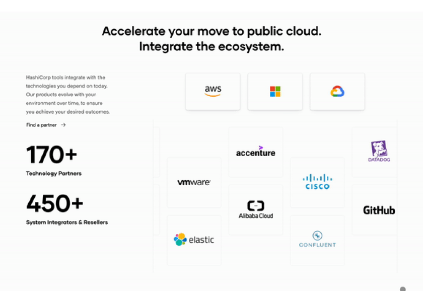
The website's main goal is to inform visitors about capabilities, benefits, and successes, trusting users to know how to contact them without overwhelming "Contact" calls-to-action in every section.
Conclusion
A benchmark that has been sited multiple times to us, from similar and completely dissimilar industries, what makes it stand out it is the cohesive and simple messaging and design. Clear messaging that has been further layered with visual design, UI, flow, and usability has resulted in a seamless and substantial website that can stand the test of time.


