Branding & Website Design for Payment Automation Product

Logo Design, Product Visualisations, Web Design, Webflow Development & Website Communication Strategies

Client
Tunnel
Industry
Payment Automation
Headquarters
Bangalore, India
Target Audience
US | Manufacturers
a green square with the letter t on it

LOGO Design

LOGO DESIGN

BRAND
IDENTITY

LOGO Design

a green and white color scheme

Identity Design

Identity Design

Visual Design

a cell phone with the text connect your erp to your bank and make cost

Website design

Website design

Website design

RESEARCH INSIGHT
the words solid and studdy core are blue
RESEARCH INSIGHT
BRAND IDENTITY
a white circle on a blue background
BRAND IDENTITY
VISUAL
LANGUAGE
two square objects with a blue center and a yellow center
VISUAL
LANGUAGE
Positioning STRATEGY
a blue background with the words simple smart secure
Positioning STRATEGY
WEBSITE DESIGN
a smartphone with the text smart systems, secured right
WEBSITE DESIGN
OVERVIEW

Highlighting Payment Flows

We focused on explaining how Tunnel streamlines and secures payments across various systems.  Resolving common challenges faced during vendor transactions. Using a unique visual language characterized by geometric shapes. We simplified Tunnel's identity, making the complex payment integrations more accessible and understandable.

The essence of this communication strategy lies in animation. By animating payment processes, we added dynamism and simplicity to complex aspects. This visual and customized approach helped in putting across Tunnel's message.  Users can now comprehend how the software eases and optimizes vendor payments. The visual storytelling enabled Tunnel to tell its story of seamless integration and execution. Making it possible to show how new-age technology can be simple, intuitive and effective to use.

tunnel stands for
FLEXIBLE
INNOVATIVE
RELIABLE
SECURE
project approach
01

Clarity and Focus

The website design showcases Tunnel's payment automation solution highlighting simplicity and cost efficiency. Straightforward messaging strategies, highlighting benefits of the software helped build an engaging narrative.

02

Simplifying The Processes

Tunnel's software directly integrates ERP systems with banks, enabling smoother cost-efficient vendor payments. We conveyed different methods used by Tunnel for making payments through animations. Our messaging and design approach simplified Tunnel's concept and methodology for the user.

04

Engagement Elements

Interactive elements capture user attention and encourage active participation, rather than passive reading. The Animation also help break down intricate processes, making technical details more accessible.

03

Responsive Design

Regardless of the device used, the design maintains a consistent look and feel, providing a familiar and comfortable user experience This helps users access the website with equal functionality whether they are on a desktop, tablet, or smartphone.

Before
After
a screenshot of a woman with headphones on
a diagram of a bank system
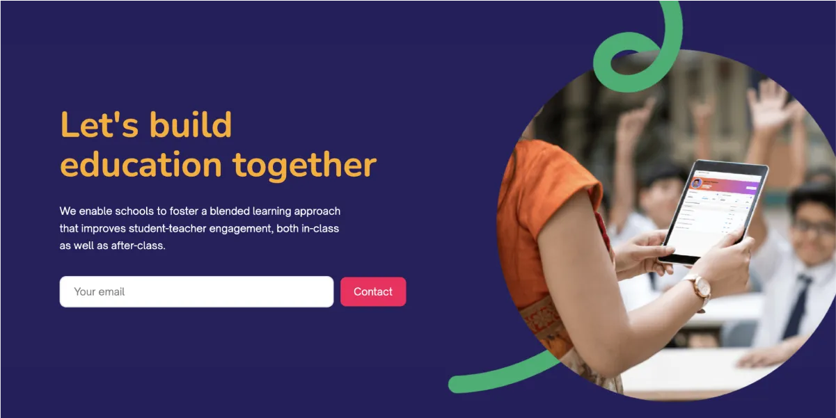
a woman holding a tablet with a group of people in the backgrounda cell phone with the text let's build education together
a screen shot of a website page with a group of people sitting at a tablea cell phone with the text transform your school to digital, today

Understanding who benefits from Tunnel and how they can use it was complex. So, we made it simpler. We created easy-to-follow visuals to help users see how Tunnel can make paying vendors easier.

Messaging
Research

Messaging Canvas created using Organised Data from the Client

The client shared well-organized data, including recordings of meetings with their clients, a comprehensive guide on software integration, and insights into how competitors, notably banks, handle similar processes. Additionally, their pitch decks were instrumental in simplifying our approach to organizing website information. This wealth of resources greatly facilitated our ability to swiftly develop and wireframe the website’s communication strategy and content layout in a user-friendly manner.

  1. The team developed a value proposition messaging canvas, which laid the foundation for a clear communication wireframe for the software's initial website version.
  2. This was bolstered by research on industries within the same sector and related fields known for effective branding and communication.
  3. Additionally, the team enhanced the website by simplifying complex processes and integrating animations for clearer explanation.
a diagram of the tumel value proposition message canvass
a man with a beard smiling at the camera

I love the way it turned out and i really appreciate all your hard-work.

I am impressed with the high quality team you have built at ED.

Amith Dayanandan
Founder & CEO

Backed by Process

Our streamlined process was greatly facilitated by the client's provision of abundant information in meetings and a well-organised folder containing comprehensive software details. This enabled us to initiate our ideation with a research-backed approach in the first stage. We then focused on messaging and visualisation in the second stage, ultimately executing the chosen design seamlessly after receiving timely client approvals.

Thanks to the initial organisation of information, Tunnel's brand identity, website, and visual assets seamlessly aligned with the company's unique value proposition. Our comprehensive approach, including research, benchmarking, and creative collaboration, served as the foundation for effectively conveying Tunnel's mission within the payment automation technology landscape in a friendly and efficient manner.